
Volt is a brief designed to raise awareness for energy efficiency in the household. This mobile application aims to help households understand their power usage and allow them to take measures to reduce it.
With the growing demand for energy efficient measures to be implemented in the home, companies struggle to bring awareness to such measures due to the lack of understanding that households have on energy usage as a whole. In response to this a digital solution must be made to demystify household energy usage and efficiency.
Mobile Application Design, Branding
Adobe Illustrator, Adobe XD
UX Designer
4 Weeks

Demystify household energy efficiency

Design an experience that's easy for households to understand

Increase energy efficiency in the household

Reduce power bill costs for the household
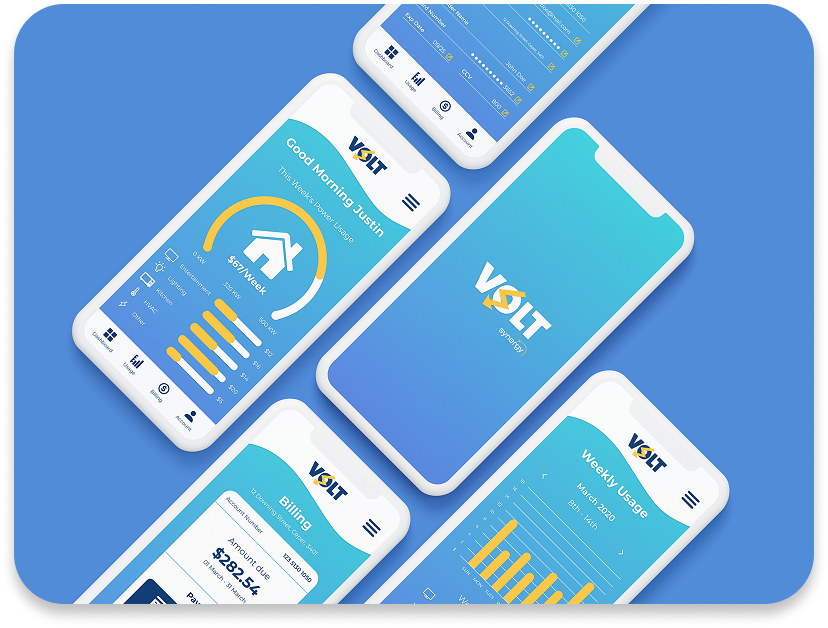
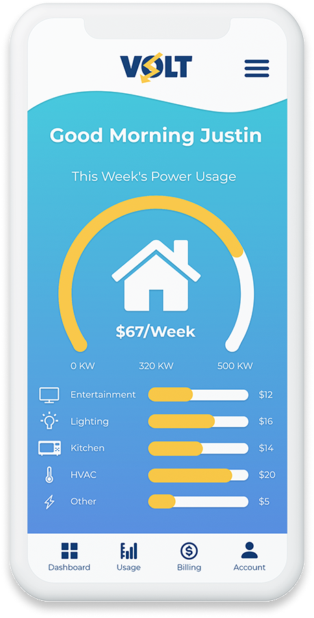
The dashboard is designed to give users a basic understanding of their power usage through the use of visual assets. Volt splits your power usage into five different categories, entertainment, lighting, kitchen, HVAC and other. The dashboard displays how much power is being used by each category, this is shown through the use of visual sliders and a cost breakdown.
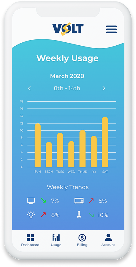
The usage page gives a more detailed look into a user’s power usage. Visual bar graphs indicate the cost for each day of the week, the option is also there to review previous weeks usages. The ‘Weekly Trends’ section below gives users a brief understanding in percentages on how much each power category is trending.
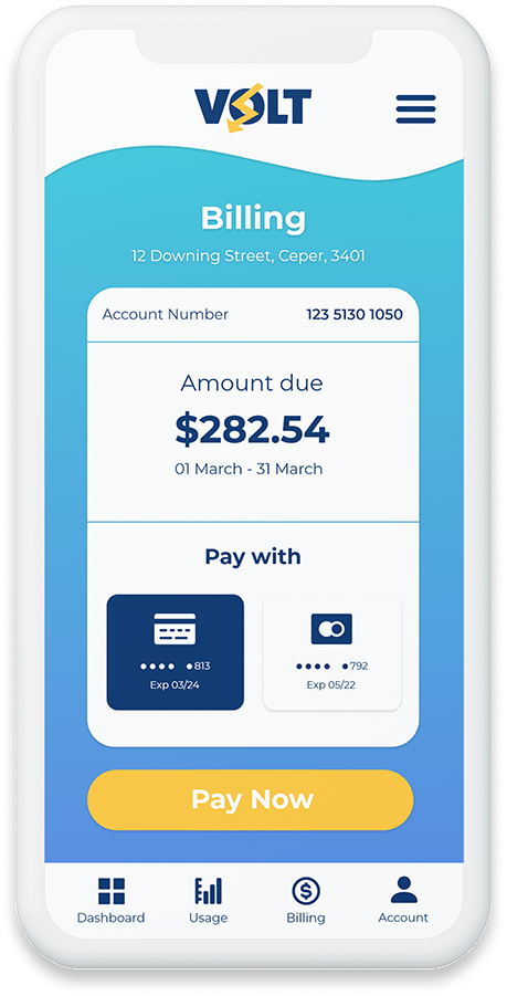
Volt makes it easy for users to pay their bill with a two step payment method. Users view their bill which displays the total cost due for that month, choose their payment method then tap the ‘Pay Now’ button, it's that easy! The detailed accounts page allows users to easily update their personal information.
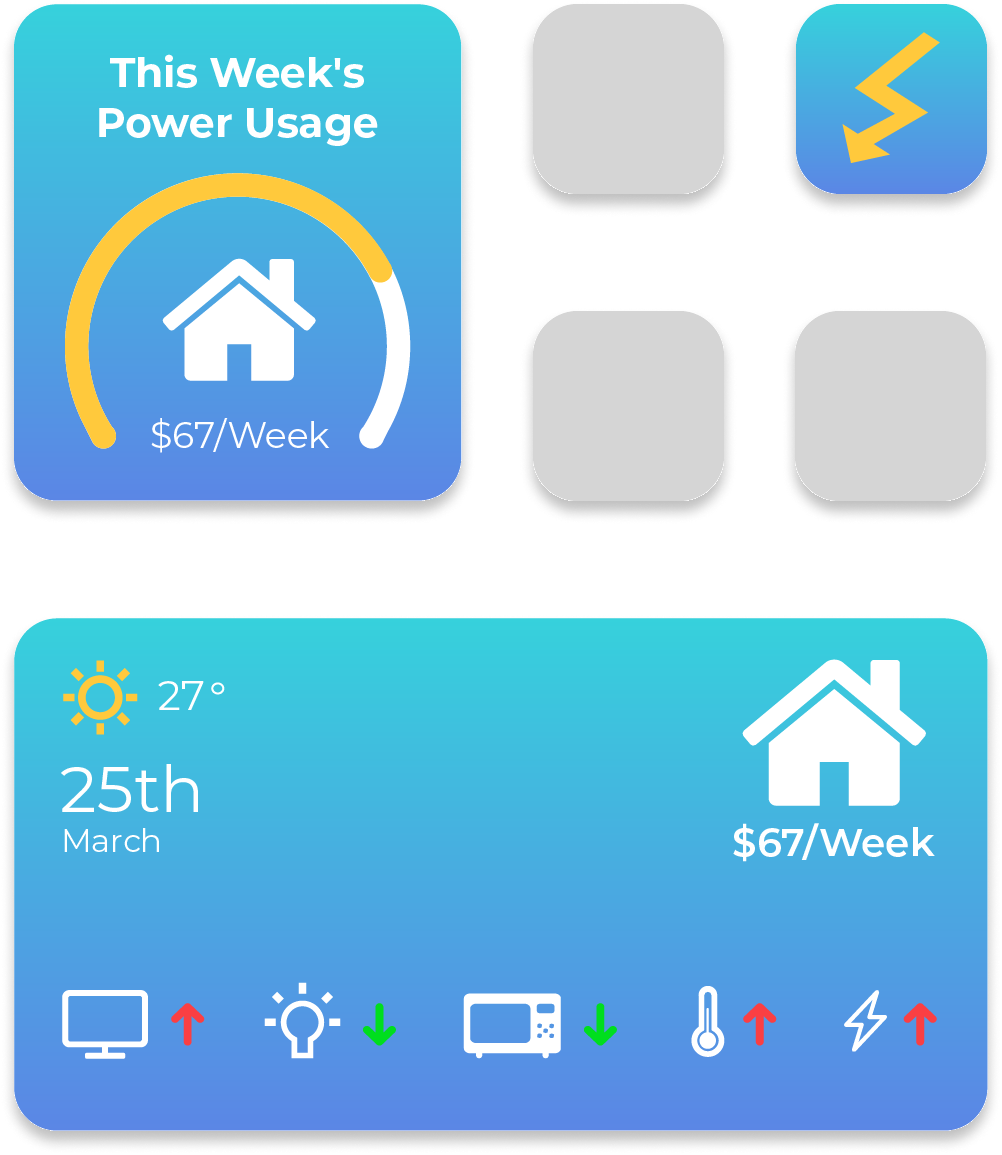
With the introduction of widgets in iOS 14, Volt has implemented two sizes of widgets to accommodate for that feature. The small two by two widget displays the dashboard’s general usage bar with an indication of the cost for that week. The larger two by four widget displays an array of visual icons used throughout the app to identify each power category and how they've trended.
1. Do you actively try to save energy in your household?
2. What information do you regularly see when viewing your power bill?
3. What information is important to you when viewing your power bill?
4. Would you be interested in a Mobile App that tracks your weekly/monthly power usage?
5. If such an App were to be built what features would you find useful to you?
The user survey found that only 28% of users had measures in place to attempt to save energy. 64% of users stated that their HVAC systems were the main culprit of power consumption followed by Entertainment and Lighting.
Users were purchasing power from a number of different retailers including Synergy, Western Power and Horizon. The majority of surveyed users received their power bill electronically (67%). The remaining 33% received theirs by mail.
In an obvious answer all users wanted to know how much and when their bill was due. 78% of users mentioned that a cost breakdown of their bill was useful for them to understand their usage. Only 35% of users stated that the kilowatts measured was useful to them.
86% of the users mentioned that they would be interested in a mobile app to view their power bill. The most popular feature requested was the ability to visually breakdown their bill into graph or image form.
A full case study breakdown of the Volt App, including research, designs and usability tests.
When designing for a specific audience it is imperative to display the most relative and useful information to them. This project has taught me that not all content is useful to everyone and that research and testing with the target audience is imperative in designing a better experience.